
Winter is quietly the most sophisticated season to get married, and the winter wedding color palettes for 2027 lean all the way into that. The light is soft and moody, the settings feel intimate and warm, and the color story you get to play with is richer and more dramatic than any other time of year. And this season, the trends are leaning all the way into that drama — bold, expressive, layered palettes are in, and the matchy-matchy pastel era is officially over.
So as a wedding designer, let me give you two things: a tour of the winter palettes couples are loving for 2026 into 2027, and — more importantly — how to figure out which one is actually right for you. Because a trend is only worth chasing if it fits your vision.
The Winter Wedding Color Palettes Trending for 2027
Here are the color stories defining winter weddings right now. Notice the theme: rich, deep, and elegant — “winter beautiful,” not “Christmas themed.”
- Moody jewel tones. The signature look of the season. Deep plum, burgundy, and merlot layered with rich accents — dramatic, romantic, and undeniably luxe. This is the palette everyone’s saving right now, and for good reason.
- Evergreen & gold luxury. Deep forest green with charcoal, pewter, and warm metallics. Forest-inspired but elevated — think a candlelit lodge that also happens to be black-tie. (Full disclosure: this is close to my own brand’s heart — emerald, gold, black, and cream — because it’s simply stunning in winter light.)
- Black-tie drama. Garnet, deep merlot, and black onyx for couples who want high glamour. Bold, formal, and unforgettable — the most dramatic option on the list.
- Icy & fresh. Slate blue, cloud white, and soft silver for a crisp, “first-snow” elegance. Cool-toned, serene, and airy — the palette for couples who want winter’s quiet beauty rather than its drama.
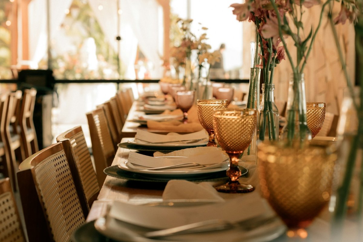
- Champagne monochrome. Champagne, pale gold, ivory, and cream layered together for a soft, shimmering, snow-globe glow. Understated luxury — tonal, warm, and endlessly elegant.
Any of these will feel current, seasonal, and gorgeous. But which one is yours? That’s the real question.
How to Choose the Palette That’s Actually Yours
A trending palette on someone else’s wedding is inspiration. Your palette has to pass a few tests I run with every couple:
Start with the feeling, not the colors. As I always say, design begins with how you want your day to feel. Dramatic and glamorous? The black-tie or jewel-tone palettes deliver that. Serene and intimate? Icy-fresh or champagne monochrome. Warm and lush? Evergreen and gold. Pick the feeling first, and the right palette practically chooses itself.
Consider your venue. Your colors have to live in a real space. A grand historic ballroom can carry deep, saturated drama beautifully. A light, airy venue might feel fought by heavy tones and sing with a softer icy or champagne palette. A rustic or lodge-like space loves those evergreen-and-gold forest tones. Always design with your venue, not against it.
Think about your light. Winter weddings often mean early sunsets and lots of candlelight — and that warm, low light does magical things to certain palettes. Jewel tones and golds positively glow by candlelight; very cool icy tones may want more intentional lighting to keep them from reading flat. Your palette and your lighting are partners.
Make sure it’s you. Here’s the test that matters most: does this palette feel like the two of you, or just like what’s trending? The most beautiful weddings I design aren’t the most on-trend ones — they’re the ones that feel unmistakably like the couple. If deep burgundy is having a moment but you two are soft-and-serene people, the icy palette will always be more “you” than the trend. Trust that. (This is the same idea behind turning a feeling into a fully designed day — the palette is where it starts.)
A Note on Using Your Palette Well
Once you’ve chosen, a designer’s tip: a palette isn’t just “our colors” — it’s how they layer. Choose a dominant tone, a secondary, an accent, and a metallic, and let them repeat across every element (florals, linens, stationery, lighting) so the whole day feels cohesive rather than like a color grab-bag. Restraint and repetition are what make a palette read as designed instead of decorated.
Let’s Bring Yours to Life
Choosing a winter palette that’s both current and authentically yours — then translating it into a cohesive, gorgeous day — is exactly the work I love as a designer. Whether you want help defining your colors or a fully styled winter wedding built around them, my Design Lab meets you where you are.
Ready to design a winter wedding that’s unmistakably yours? I’d love to hear what you’re dreaming up. Book a discovery call and let’s talk about your palette.
Live Intentionally. Celebrate Loudly.